
05 Sep Color Palettes for Kids
Decorating your child’s room should feel joyful—not chaotic. While bright primary colors often dominate kids’ spaces, softer tones can offer a sense of calm, comfort, and beauty that both children and grown-ups appreciate. At ViveNook, we believe that a child’s space should be as thoughtfully designed as the rest of your home—filled with color that soothes, not overstimulates.
Why Gentle Colors Work
Gentle, muted palettes are more than just trendy—they support a nurturing environment. Soft hues encourage calmness, enhance focus, and make bedtime routines feel more serene. Plus, they create a timeless foundation that evolves with your child’s personality and needs.
These colors are also versatile: it’s easier to mix, match, and layer decor pieces over time without needing a full redesign. And they tend to blend beautifully with natural materials like wood, rattan, and linen—a staple look for modern, cozy kids’ rooms.
Palette Ideas to Inspire
1. Soft Sage & Natural Wood
This earthy combination is ideal for Montessori-inspired or nature-themed rooms. Sage green adds a touch of calm and connection to the outdoors, while wood tones keep the room feeling grounded and warm.
2. Warm Clay & Cream
Clay tones bring a cozy, grounded feel, and when paired with creamy whites, the result is soft and inviting. This palette feels modern, gender-neutral, and grows easily with your child.
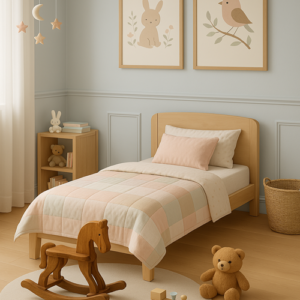
3. Dusty Rose & Light Taupe
A sweet alternative to classic pinks, dusty rose offers softness without being overly sugary. Light taupe balances the palette with elegance and a bit of sophistication—perfect for a peaceful nursery.
4. Muted Blue & Butter Yellow
This cheerful combo brings subtle energy to a room without feeling too loud. Muted blue has a calming quality, while butter yellow adds a gentle splash of sunshine and happiness.
5. Lavender Mist & Soft Grey
Dreamy and whimsical, this palette is ideal for bedtime routines and imaginative play. Lavender mist soothes, while soft grey adds depth and pairs effortlessly with other tones.
Tips for Bringing It to Life
- Start Small: Use these palettes in textiles like bedding, curtains, and rugs to gently introduce color.
- Keep Walls Neutral: A soft base allows for easy updates as your child grows.
- Add Accents: Toys, books, and wall art are great for layering color without commitment.
- Mix, Don’t Match: Slight variations in tones keep the space feeling organic and relaxed.
Final Thoughts
Creating a room for your little one doesn’t mean sacrificing style for function. Soft, thoughtful palettes can make a space feel both playful and peaceful—a haven where your child can rest, play, and grow. At ViveNook, we curate kids’ products that pair beautifully with these sweet, not overwhelming color stories. Explore our collection and bring home the beauty of balance.